A redesign of the human-in-the-loop experience — making the agent's intent legible, its boundaries explicit, and user control deliberate.
Empower users to orchestrate AI execution with confidence by utilizing progressive, high-legibility feedback to make human-in-the-loop handoffs predictable, minimizing cognitive load and ensuring anxiety-free fallbacks.
For full context, see the Product Audit.
The audit identified three structural gaps across the task lifecycle: missing plan previews before execution, a lack of recovery paths during execution, and unstructured handoffs after completion. To address these, I apply IBM's AI maturity curve. This framework explains how AI systems must evolve from Human-in-the-Loop (HITL) supervision to full autonomy (HOOL). While Simular's ultimate vision is full autonomy, the agent currently operates in the HITL stage and needs to earn user trust. The four design principles below define how the interface closes these gaps and helps the agent progress along the spectrum.
HITL
Human-in-the-Loop
Human reviews and approves each critical decision. Current necessity.
HOTL
Human-on-the-Loop
Human monitors and can intervene when needed. Near-term target.
HOOL
Human-out-of-the-Loop
Fully autonomous. Human sets goal, receives result. Long-term vision.
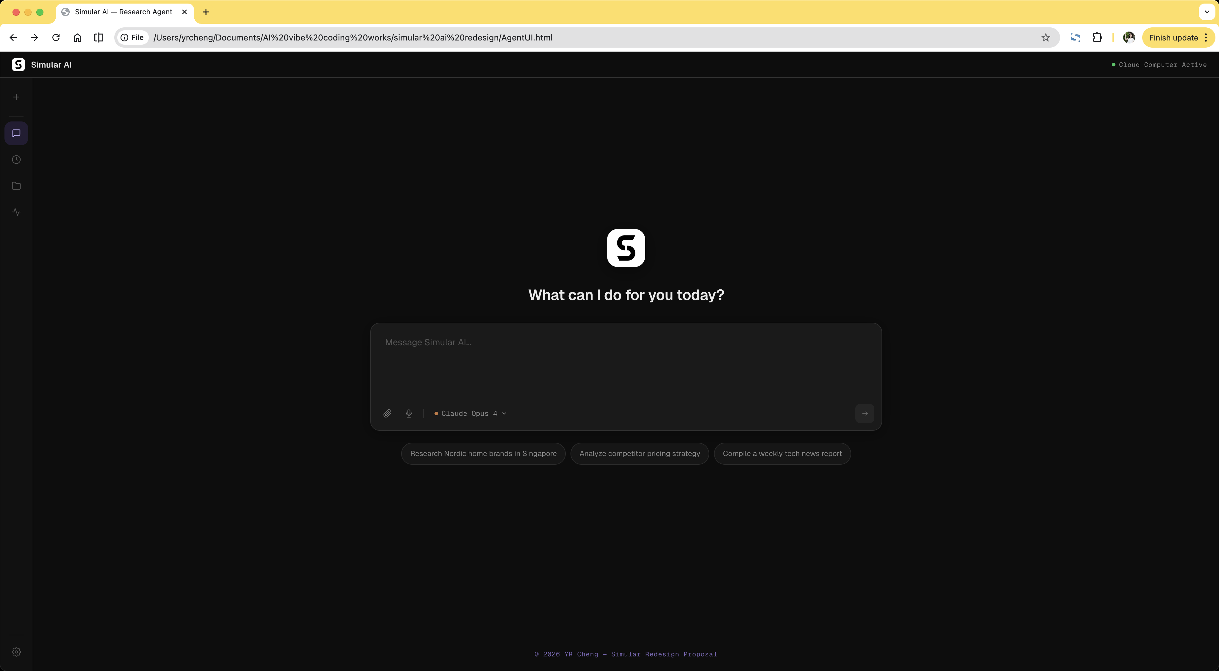
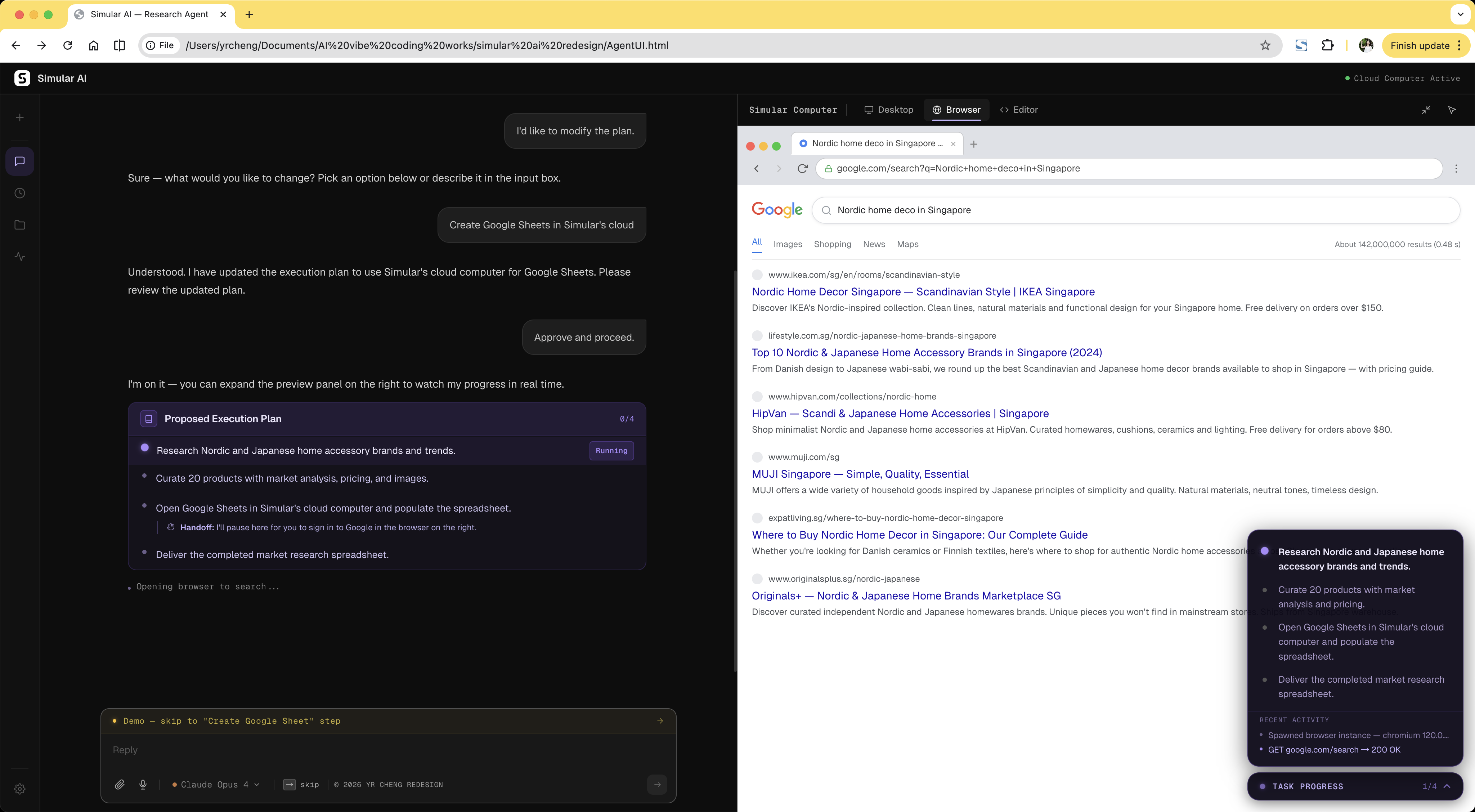
Six design decisions that build trust across the task lifecycle: before the agent acts, while it runs, and after it delivers. Each maps to a gap from the audit, applies a specific principle, and includes the trade-off.
Before execution, users have no idea what the agent is about to do, how long it will take, what data it will touch, or when it will need their help. A plan preview creates shared expectations before anything happens — and flags handoff moments like authentication upfront, so they don't arrive as surprises mid-task.
Trade-off: Not every agent needs this checkpoint. But for agents still maturing in reliability, a 10-second plan review catches misalignments early, reduces costly mid-task failures, and builds the trust that earns autonomy over time.

Before Agent outlines steps briefly, but they're collapsed by default — easy to miss. Users enter execution without a clear picture of what's coming.

After Numbered plan surfaces handoff steps upfront, so users know exactly when they'll need to act — before the agent starts.
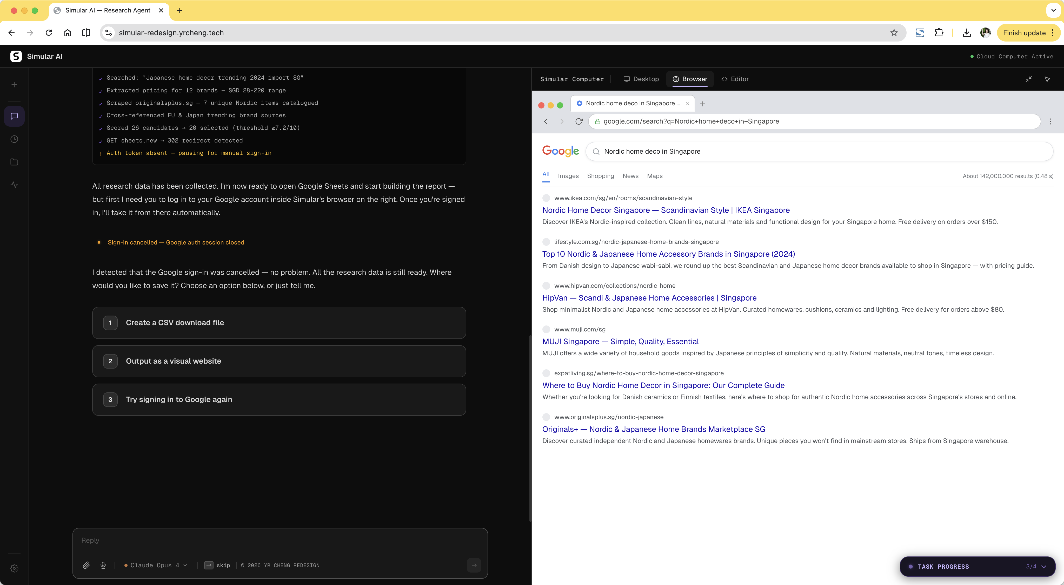
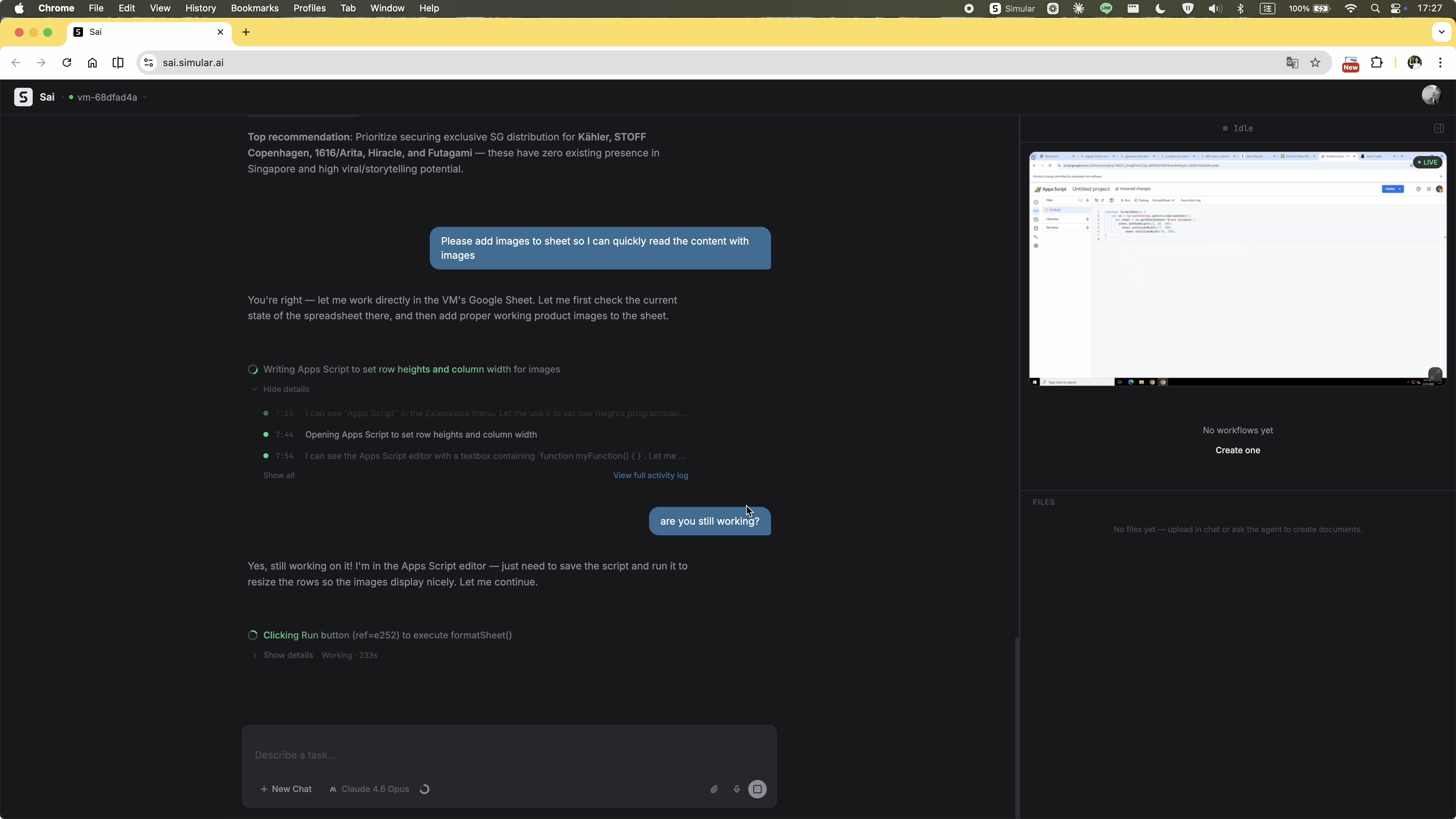
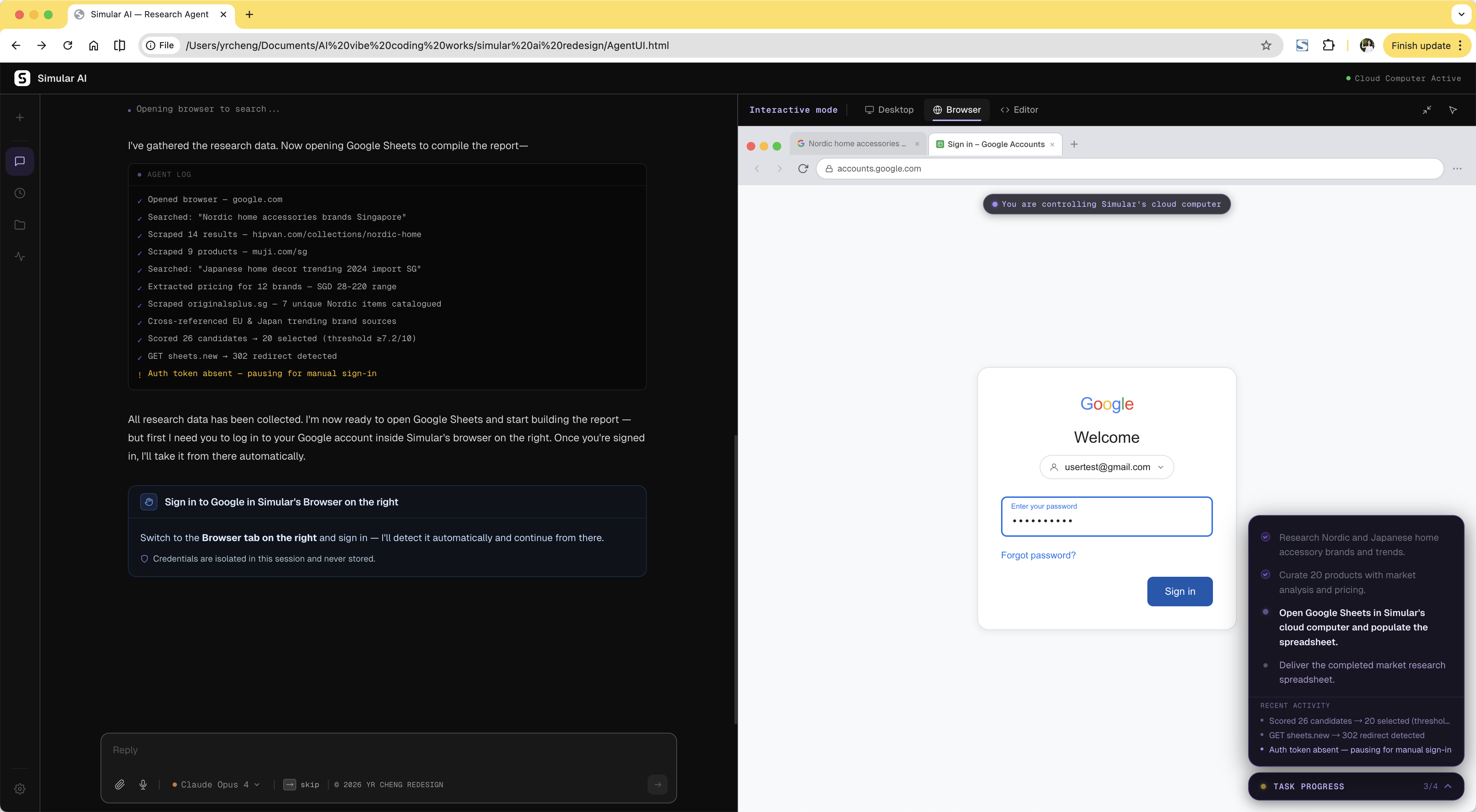
The original flow pushed OAuth through a desktop popup. Dismissing it caused the agent to retry endlessly with no explanation and no escape. The redesign treats authentication as a deliberate handoff: the agent pauses, explains what it needs, and directs the user to the browser panel. If the user cancels login, the agent responds immediately with a clear recovery path instead of stalling.
Trade-off: Less seamless than a fully automatic flow. But an agent that pauses cleanly and recovers gracefully is far more trustworthy than one that loops silently until it times out.

Before Desktop OAuth popup — deny it and the agent loops with no exit.

After Agent pauses, explains, directs — user signs in and agent resumes automatically.
When login is cancelled, the agent doesn't stall — it surfaces a recovery message with options to retry, modify the task, or skip the step entirely.
Two design decisions that solve the same problem from different angles: how do you let users see what the agent is doing without accidentally disrupting it?
Trade-off: More interface surface area. But for a product where the agent operates autonomously in a live environment, visibility without interference is the core trust mechanism. Tabs show what's happening; the takeover dialog controls when you act on it.
Three tabs surface the agent's three execution contexts in real time. Desktop shows the Ubuntu environment. Browser shows live web activity. Editor shows syntax-highlighted code and terminal output. All are view-only by default — you can watch without touching.
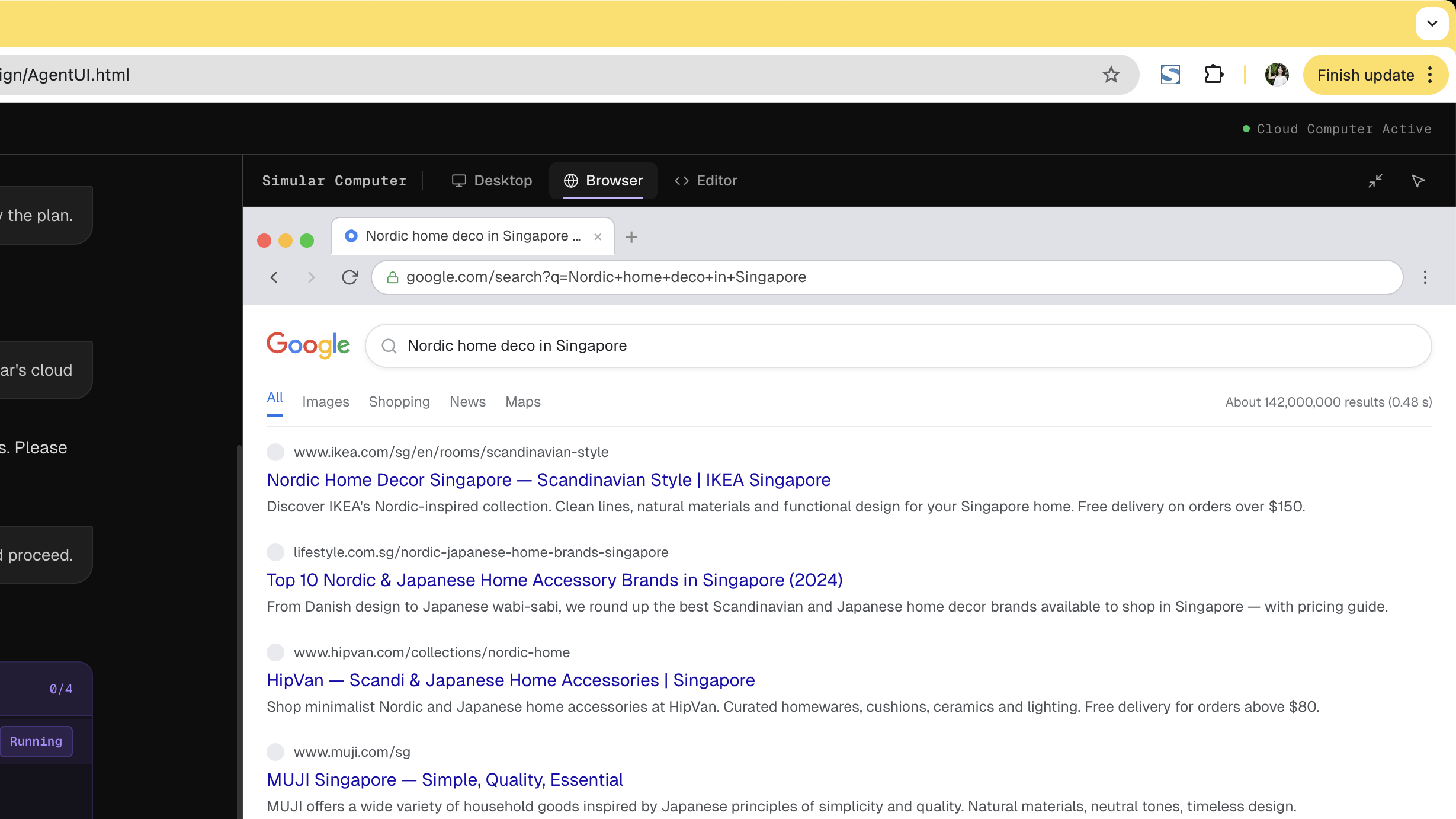
Browser Tab active — Desktop / Browser / Editor visible in header
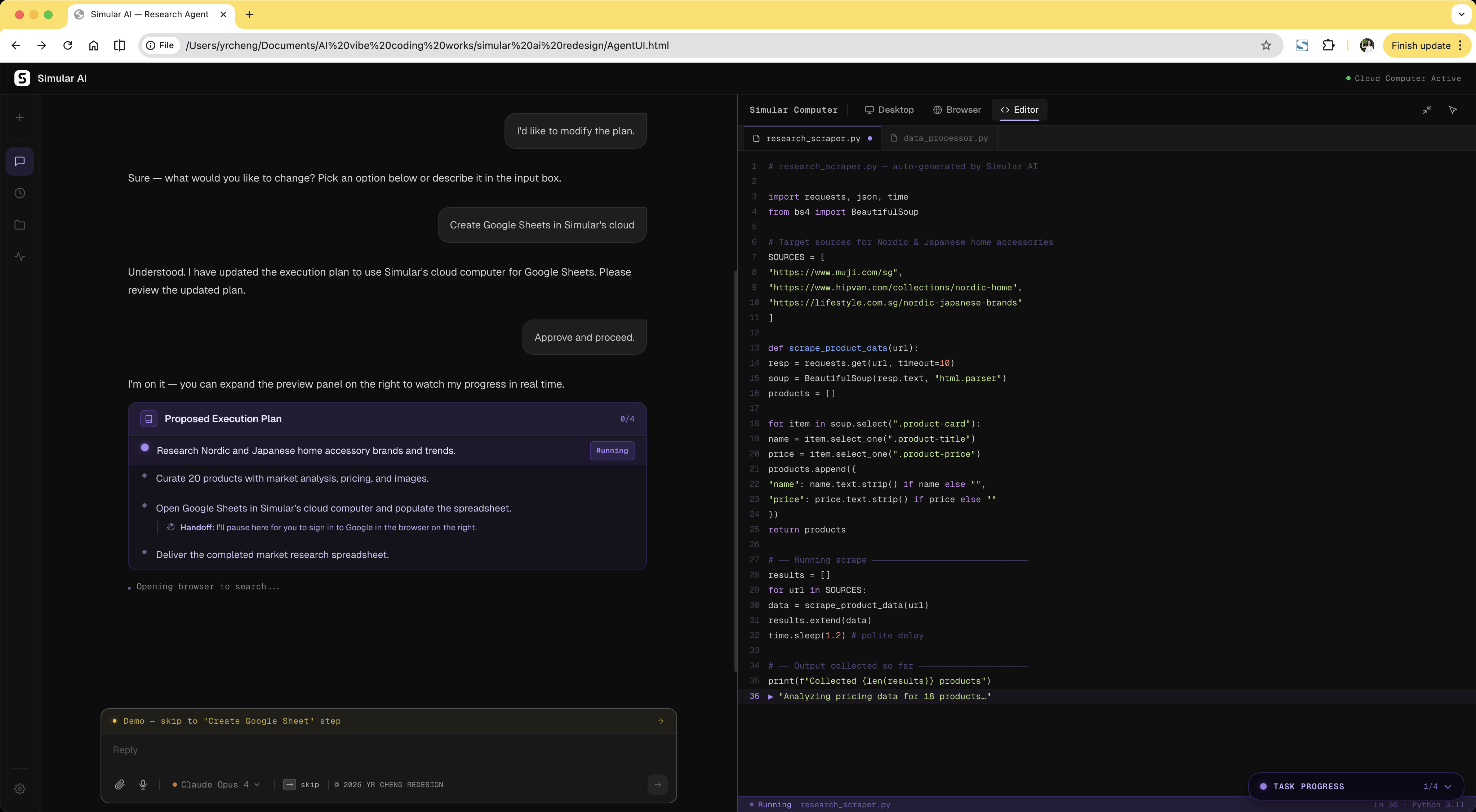
Editor Tab active — syntax-highlighted code, terminal output
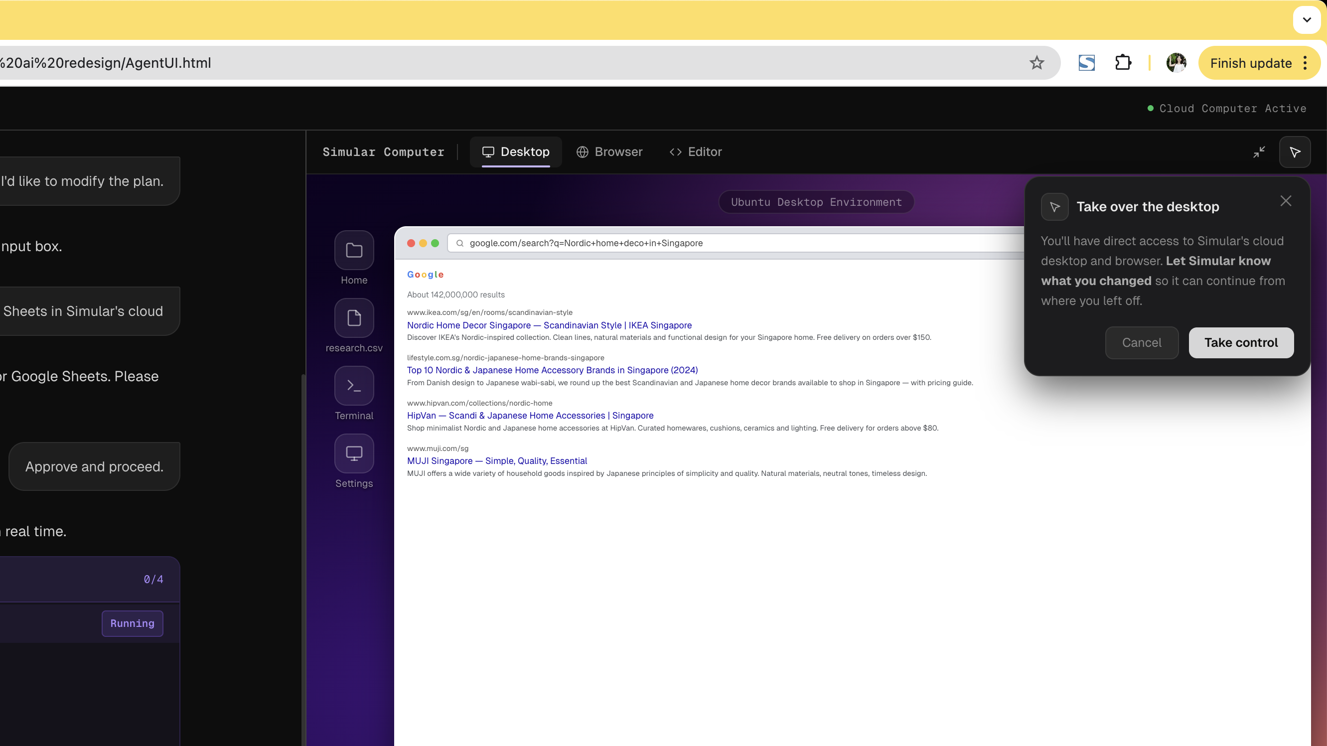
Clicking into the desktop doesn't silently hand control to the user — it surfaces an explicit confirmation dialog first. This single friction point prevents accidental interference while preserving the ability to intervene deliberately. Interactive mode also activates automatically during agent-initiated handoffs like authentication.
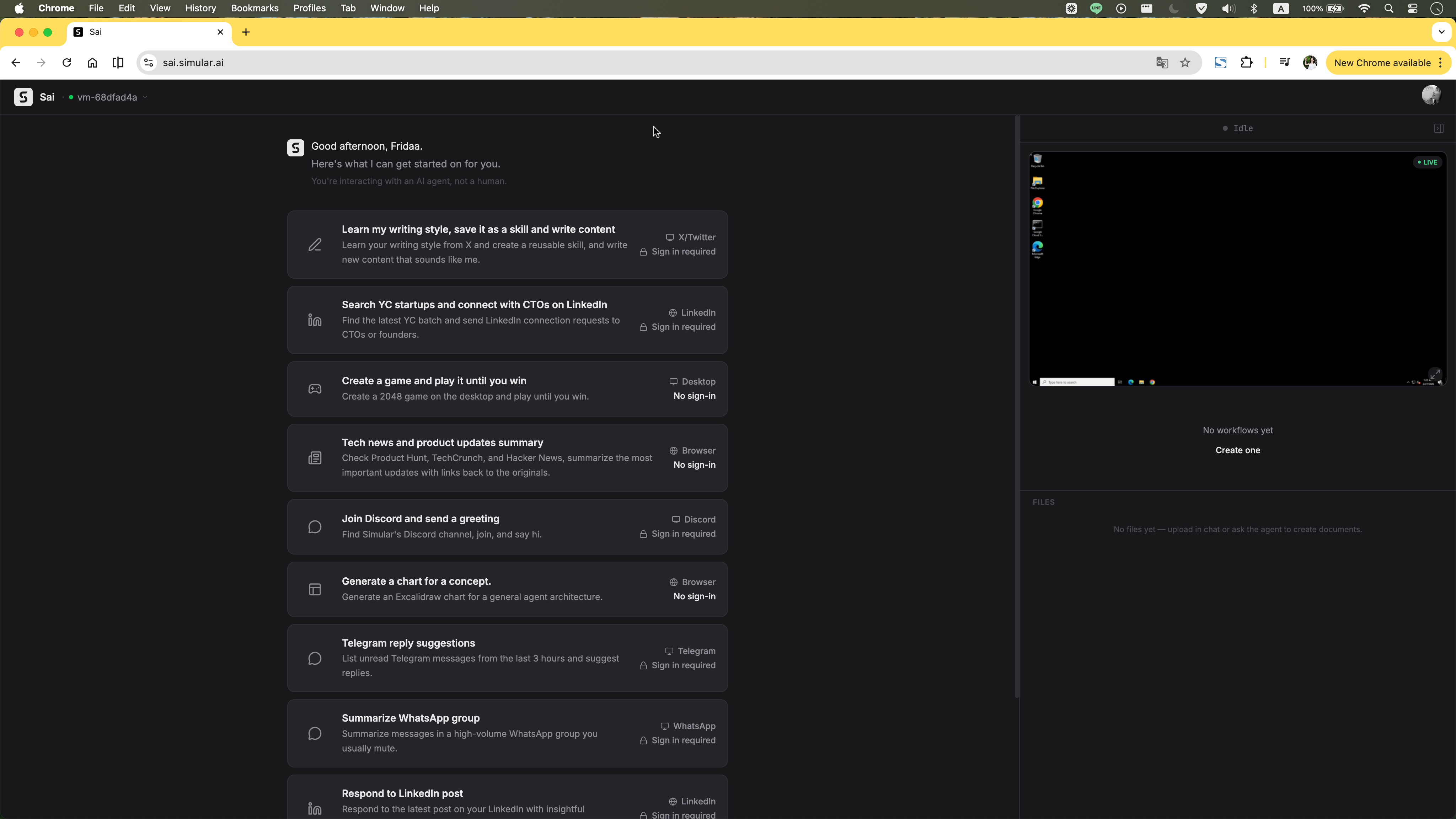
The original interface opened with a split-screen layout and a live VM preview before the user had even typed a task. For new users, this is immediately overwhelming. The redesign starts with a single centered input field. The cloud computer panel only appears after the plan is approved, matching the user's growing mental model rather than front-loading every capability at once.
Trade-off: Power users may want immediate workspace access. A shortcut is available, but the default prioritises the first-time experience. Progressive disclosure doesn't hide capability; it sequences it.
Before Original homepage: task list and VM panel loaded immediately on open.
After Redesigned homepage: clean centered input with suggestion chips. Workspace reveals only after plan approval.
Even after the cloud computer appears, it doesn't demand attention. It starts as a compact preview tucked to the right, letting users stay in the chat flow. One click expands it into a full Split View workspace — chat on the left, cloud computer on the right — so users can watch the agent work without losing conversational context.
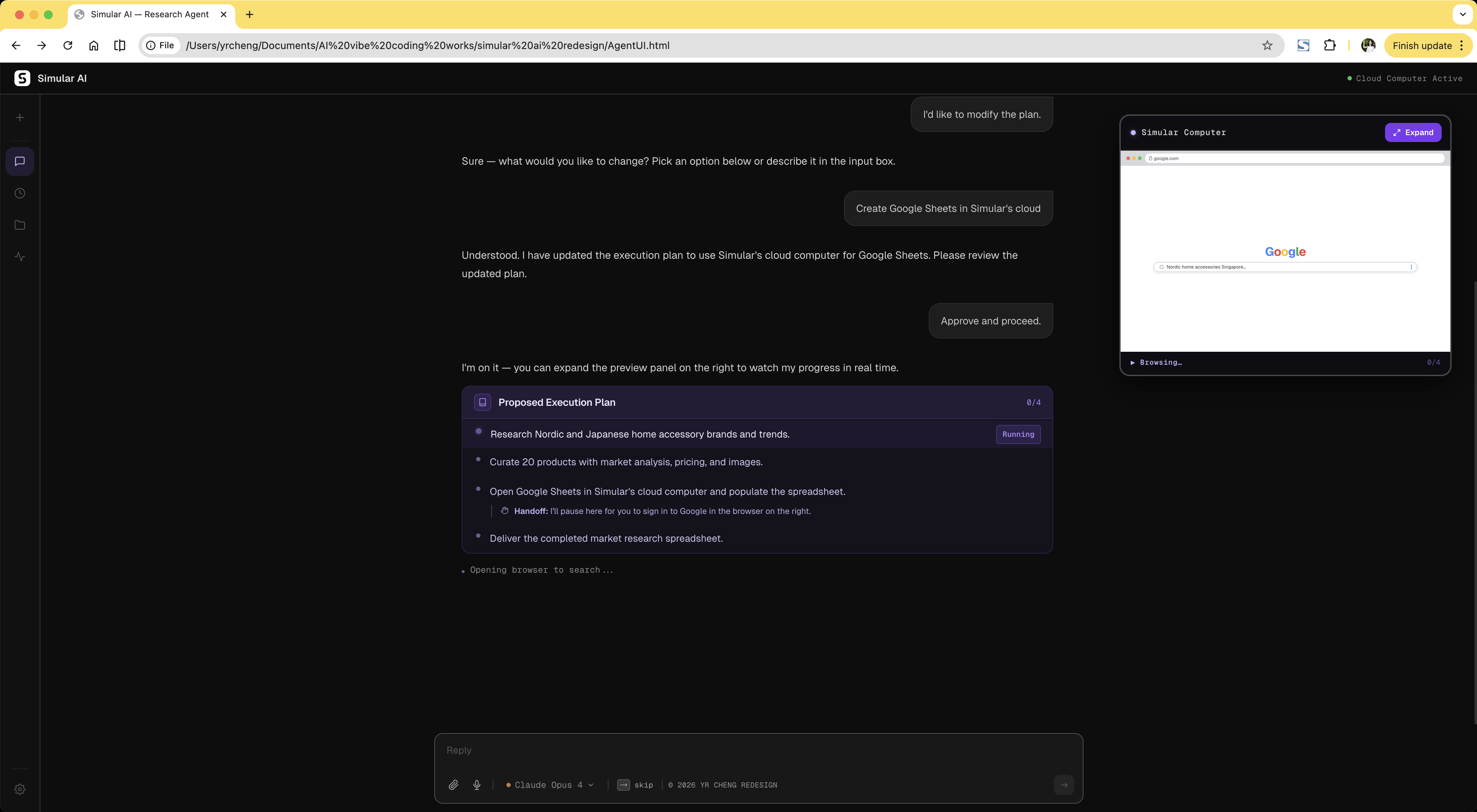
Preview A compact cloud computer preview appears on the right, letting users stay in the chat flow or expand into full Split View.
Split View Click to enlarge into a full workspace, so users can follow the chat and watch the cloud computer side by side.
A text “done” message forces users to hunt for their output inside the VM. Structured delivery surfaces the result immediately: file card, export options, and next actions in one view.
Trade-off: Adds interaction after the main task. But showing what was actually produced, and giving the user immediate ways to use it, is the difference between completing a task and delivering value.
Before Text-only “done” — user must find output manually.

After File card, CSV export, and next actions — all visible immediately after completion.
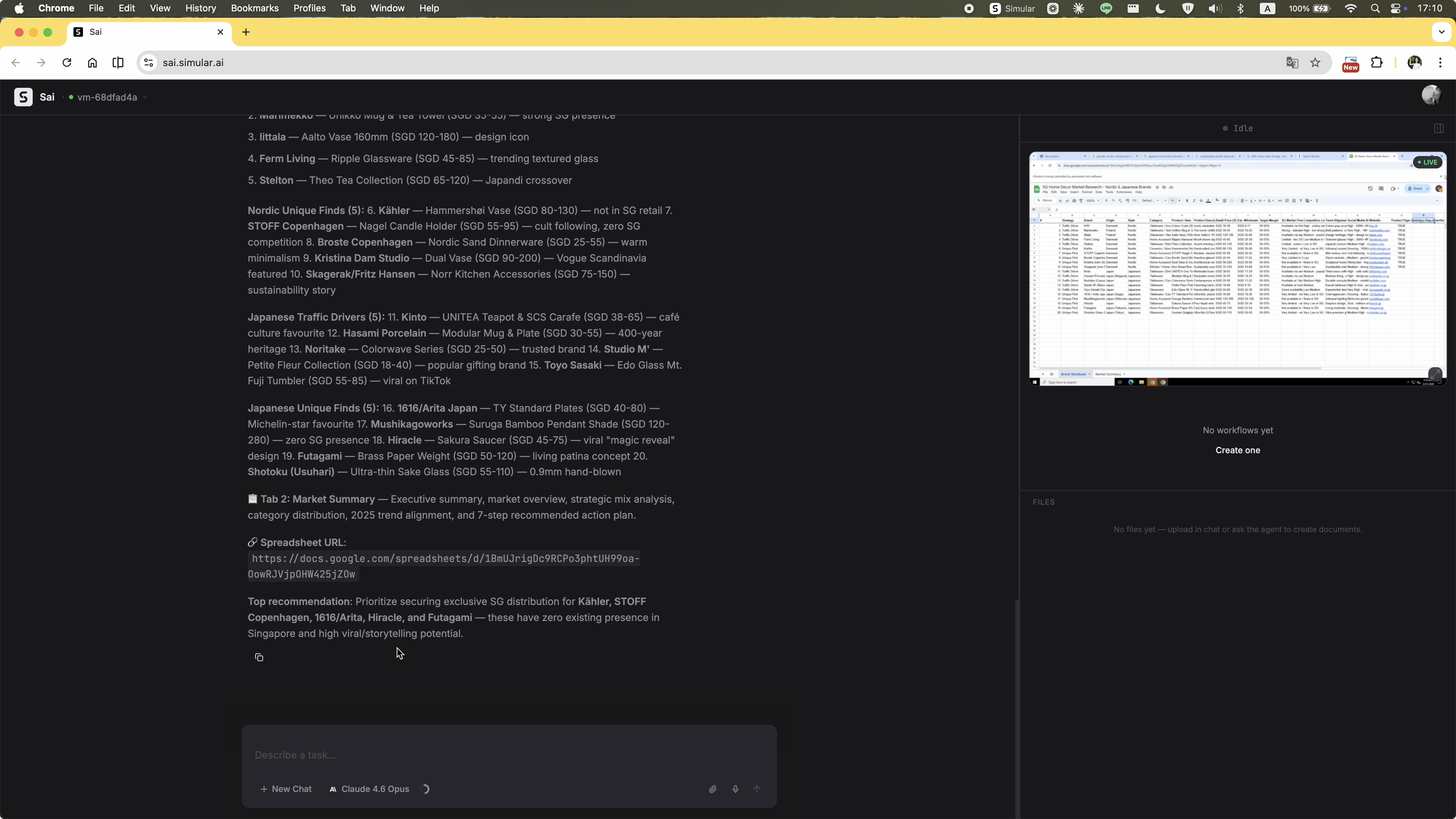
The original execution stream updated constantly but had no hierarchy. Agent reasoning, process logs, and required actions all appeared as undifferentiated text. There was no sense of how far the task had progressed or whether the agent was stuck. The redesign adds a persistent progress sidebar that shows each step, its current status, and a real-time activity log. At any point during execution, the user knows exactly where the task stands.
Trade-off: Uses screen real estate. But constant orientation is worth the space for multi-step tasks that run for minutes. The sidebar also serves as the primary trust signal during execution: it proves the agent is making progress, not spinning in place.
Before Undifferentiated text stream. No stage indicator, no way to tell progress from failure.
After Persistent sidebar with step status, current stage, and real-time activity log.