Interface Context
Cards in the Chat Panel
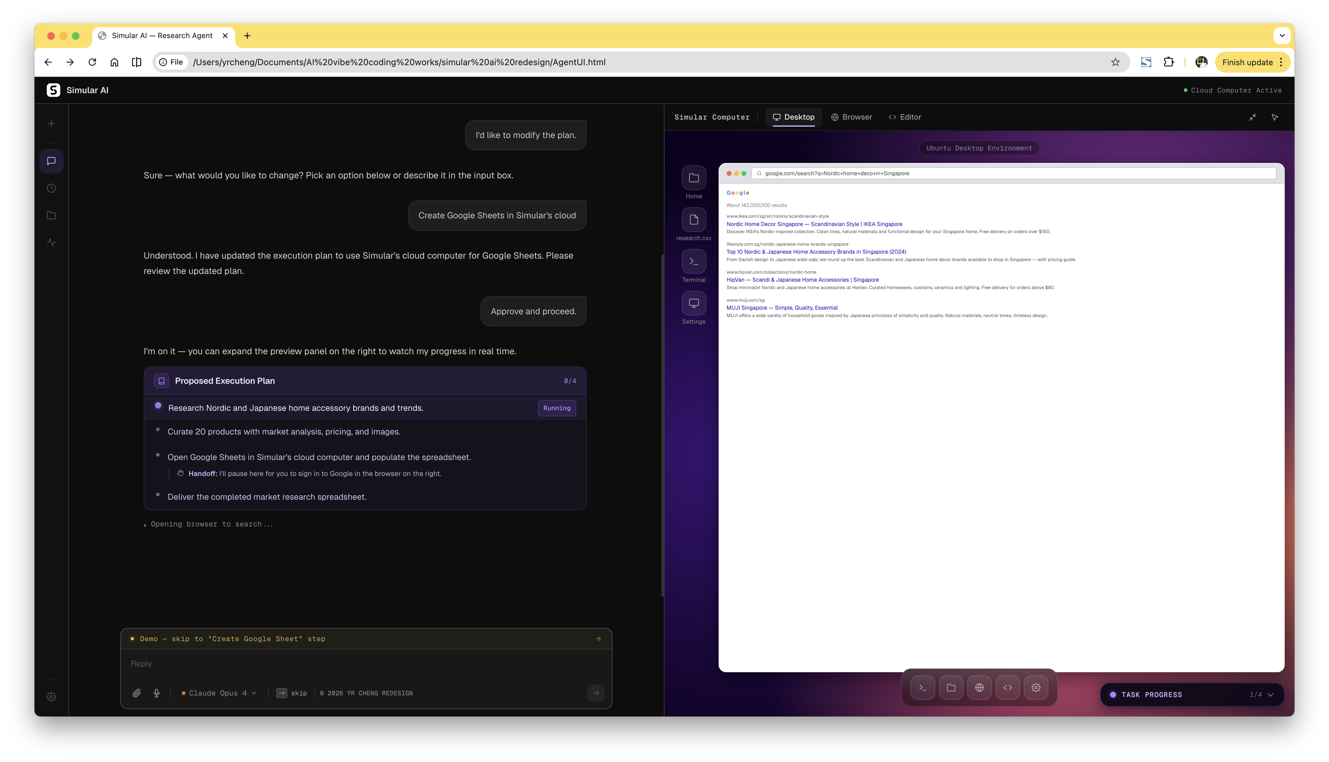
Execution Plan Card
Appears in the chat panel before the agent starts. The user reviews each step and approves — or modifies — the plan before anything runs.
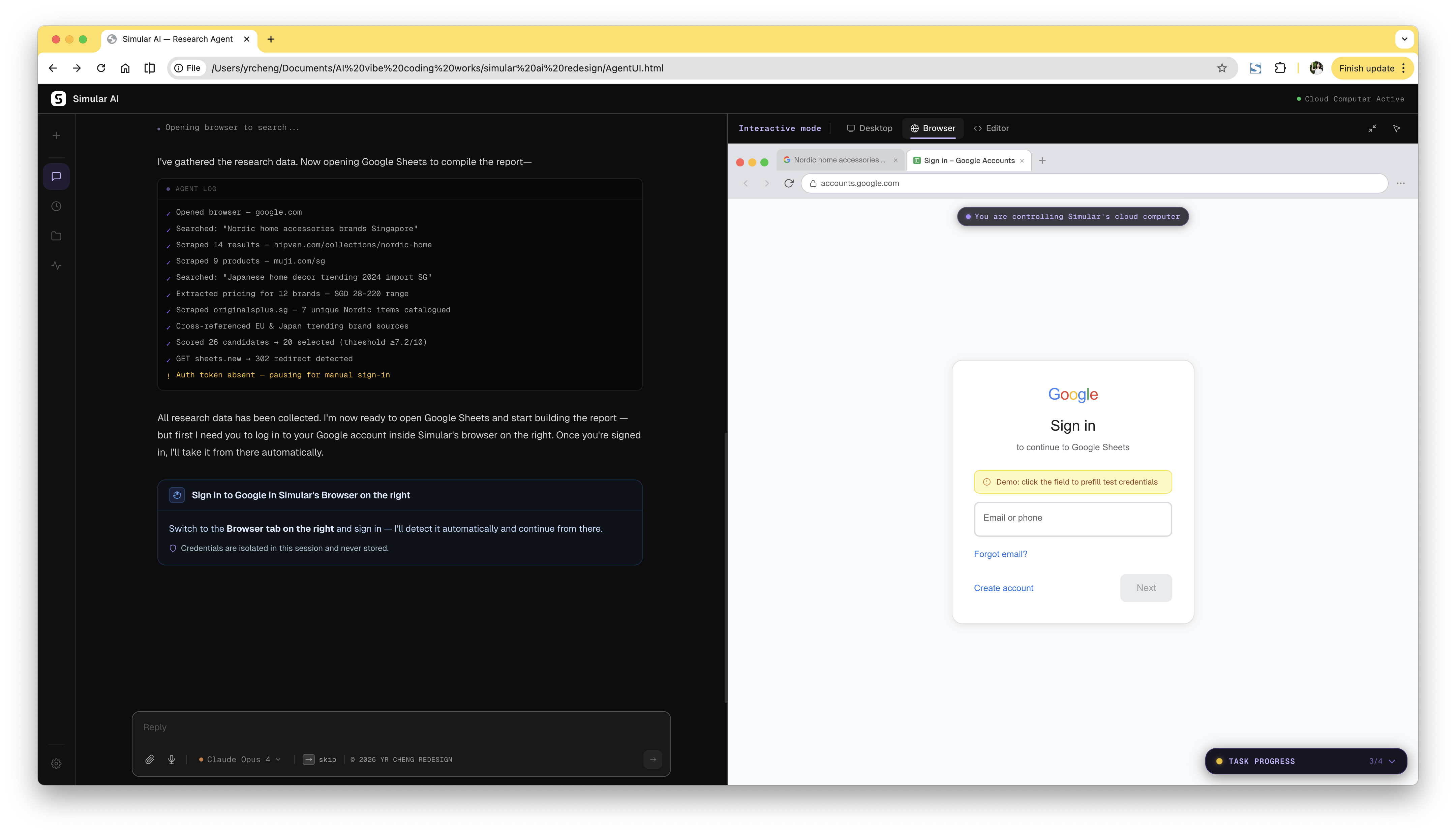
Google Sign-in Required Card
Surfaces mid-task when the agent needs user credentials to continue. Once the user signs in, the agent resumes automatically — no manual re-trigger needed.